Domestic Exhibition Area 星外視覺整合有限公司 / ET Design Studio

致力於將設計美學提升到更深層次,品牌核心價值包括「在地文化設計」、「美感教育推廣」和「品牌形象輔導」。 我們專注於打磨每一個細節,提供品牌設計、包裝設計、書籍裝幀、廣告視覺設計及網頁介面設計等多種服務。作為生活美學和在地品牌再造的推動者,我們與客戶合作創建了許多具市場能見度和品牌力的專案。我們不斷重塑在地品牌,延續品牌生命,讓每一個品牌都能展現其獨特價值。
ET Design StudioHer dedication to elevating design aesthetics to a deeper level is reflected in the core brand values: “local cultural design,” “promotion of aesthetic education,” and “brand image consulting.” We are committed to perfecting every detail and offer a wide range of services, including brand design, packaging design, bookbinding, visual advertising design, and web interface design. As advocates for lifestyle aesthetics and local brand revitalization, we collaborate with clients to create projects that command strong market visibility and brand impact. We continuously reshape local brands, extend their lifespan, and help each one showcase its unique value.
協同策展人
Collaborative Curator

王思尹 / Wang Ssu-Yin
協同策展團隊
Collaborative Curatorial Team
黃泰承 Huang Tai Cheng
TAKE A LOOK AT OUR WORKS

王思尹
#裝幀及書籍設計
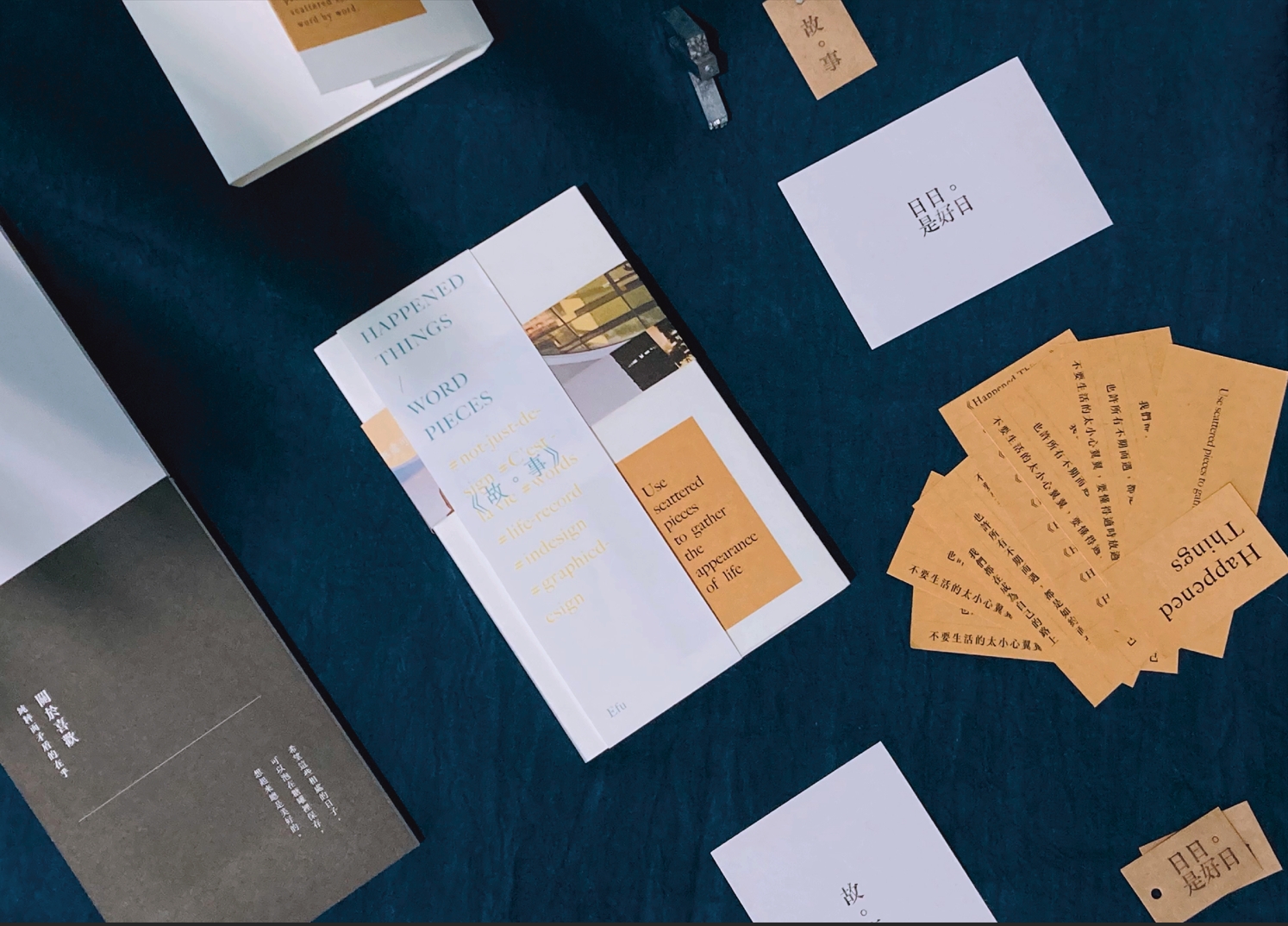
散文是生活的一種烙印,拼湊時光裡片段的記憶。
整體分類成五個合輯,關於理想、感受、喜歡、日常、秘密,諸多來自過往的文字,一字一句撿起時光裡零散的自己。
文字是療癒的力量,散文是生活的一種烙印,封面使用白色棉卡製作空白書封,選用鉛字的活字版印章,體現文字的烙印和生活的烙印。內頁使用石灰白的紙,手感並些微泛黃,就像過去的事件在記憶裡褪色。
看故去往事,褪色的事件留在文字裡,而後繼續前行。
Wang Ssu-Yin
Bookbinding and Book Design
Prose is an imprint of life, piecing together fragmented memories of time.
The work is divided into five collections, revolving around ideals, emotions, preferences, daily life, and secrets—composed of words from the past, retrieving scattered pieces of oneself through each sentence.
Words have the power to heal, and prose is an imprint of life. The cover is made with white cotton cardstock, featuring a blank book jacket and a movable type letterpress stamp to symbolize the imprints of words and life. The inner pages are printed on off-white paper with a slightly yellowed texture, resembling the fading of past events in memory.
Looking back at past events, faded moments are preserved in words, allowing us to continue moving forward.

黃泰承
#品牌識別
臻田牙醫診所 HOUDUI DENTAL CLINIC
在屏東內埔的田野上,有一處我們自豪地稱之為家園的地方「臻田牙醫診所」。
這個名字,蘊含著我們對這片土地的情感認同和對人們健康的關懷,也同時象徵我們對每一位客戶的專業致敬,以及對內埔這片土地的敬重,身處於內埔這片擁有濃厚客家文化和歷史的土地上,我們深受這片土地的啟發。
Huang Tai Cheng
Brand Identity
Houdui Dental Clinic
In the fields of Neipu, Pingtung, there is a place we proudly call home—Houdui Dental Clinic.
This name embodies our emotional connection to this land and our care for people’s health. It also symbolizes our respect for each client’s needs and our homage to Neipu, a land rich in Hakka culture and history. We are deeply inspired by this land.

黃泰承
#品牌識別
Karuna Seeds
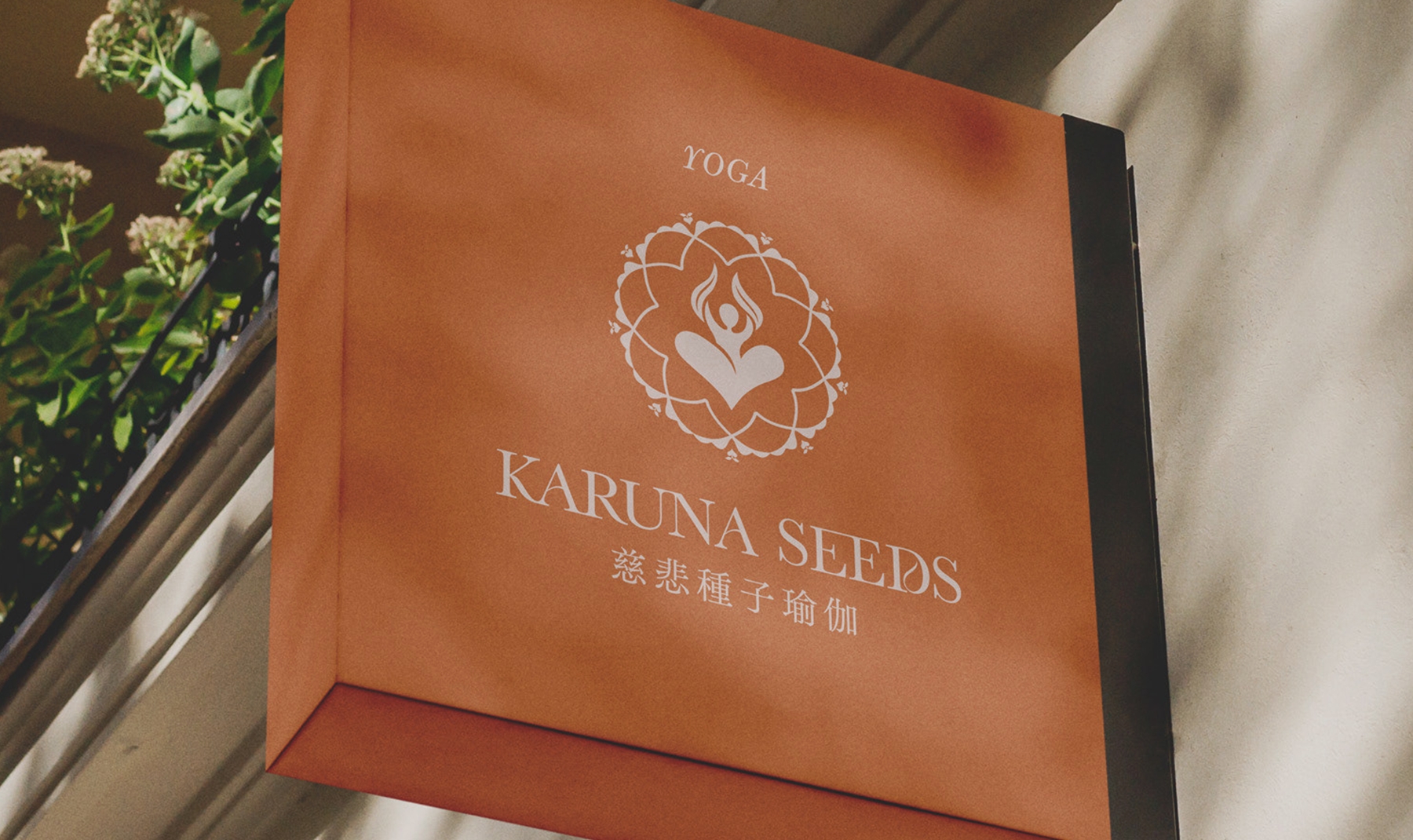
慈悲種子瑜伽致力於在現代世界中傳播古老的瑜伽教導,保存當中永恆的精華,並將其融入到我們的日常生活。
世界所帶來的挑戰雖然不斷變化且越來越複雜,但瑜伽卻讓我們知道,要尋找、轉化自己的限制並從中成長,總是可以簡單地從自己的身心開始。
我們定期與世界各地多處瑜伽館與非營利組織合作,致力於透過協助保存、傳播和支持瑜伽的傳統教導,在更多人心中種下和培育慈悲的種子,讓其開花結果。
Huang Tai Cheng
Brand Identity
Karuna Seeds
KarunaSeeds Yoga is dedicated to spreading the ancient teachings of yoga in the modern world, preserving its timeless essence, and integrating it into our daily lives.
Although the challenges of the world continue to change and become more complex, yoga teaches us that we can always begin with our own body and mind to find, transform, and grow from our limitations.
We regularly collaborate with yoga studios and non-profit organizations worldwide, aiming to assist in preserving, promoting, and supporting the traditional teachings of yoga. By doing so, we plant and nurture seeds of compassion in more hearts, allowing them to blossom and bear fruit.

黃泰承
#介面設計
2024 翻你的老屋 品牌官網介面設計
「住的舒服,家就幸福」家居是一個和諧、平靜且舒適的空間,每個家都反映居住者的個性和品味,客製化每個家且營造出溫馨舒適的氛圍。裝修設計的市場蓬勃,吸引許多專業人士投入,不論是在新成屋、商業空間、老屋翻新的領域,我們希望能夠秉持「專業透明」的理念,透過自媒體讓大眾更了解其過程,放心的把家交給我們。
Huang Tai Cheng
Interface Design
2024 Lao Wu House Website Interface Design
"Living comfortably brings happiness to the home". A home is a space of harmony, peace, and comfort, where every home reflects the personality and taste of its inhabitants. We customize each home, creating a warm and cozy atmosphere. The renovation and design market is thriving, attracting many professionals in fields such as new residential properties, commercial spaces, and old home renovations. We aim to uphold the principle of "professional transparency", using social media to help the public better understand the process, giving them the confidence to entrust their homes to us.

王思尹
#品牌識別
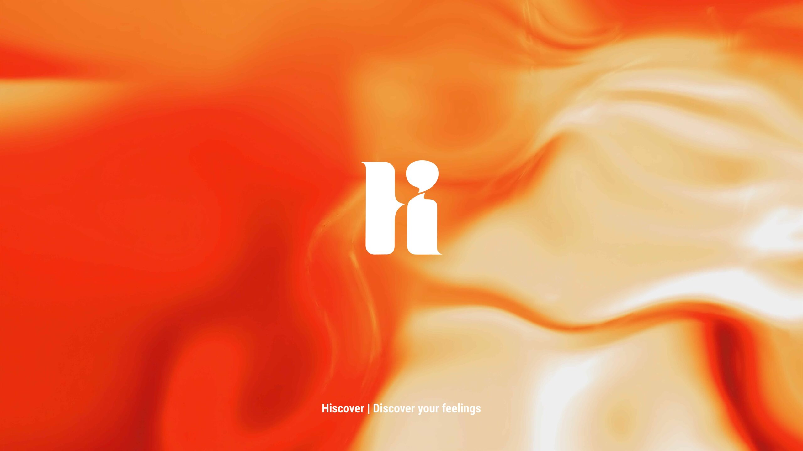
液態的熟成感,談茶酒師的個人品牌。
茶和酒是充滿變化的,不同溫度、工法、過程,能造就不同風味,每個變動、狀態,都是流動且有層次的,漸層色的符號,透過烘烤與熟成度的連結,加入火焰顏色意象象徵成熟過程,自由界定熟成度,讓液態流動感與顏色互動,創造架構與概。
只從個人的角度定義,為個人品牌識別系統保留更多變化的可能樣貌,也呼應品牌代表的個人化、狀態持續變動的特性,藉此建構傳承與創新並行的品牌深度。
Wang Ssu Yin
Brand Identity
The Maturation of Liquids - A Tea and Wine Specialist’s Personal Brand
Tea and wine have complex, evolving flavors. Factors like temperature, technique, and process all contribute to different tastes. These changes are dynamic and multi-layered, symbolized by gradient colors that represent the roasting and aging processes. The imagery of flames conveys the idea of maturation. This allows for flexibility in defining the level of maturity, where the fluid nature of the liquid interacts with color, creating a sense of structure and growth.
This personal branding system emphasizes flexibility, reflecting the brand’s personalized approach and its constantly evolving nature. By balancing tradition with innovation, the brand develops a deep and dynamic identity.
Defined only from a personal perspective, it retains more possible changes in the personal brand identification system, and also responds to the personalization and continuous change of status characteristics of brand representatives, thereby building a brand depth with both inheritance and innovation.